PIANO BOOK - ALBUM CAMPAIGN
For an international icon like Lang Lang we knew we had to put together something very special when conceptualising the creative direction for his latest album’s campaign.
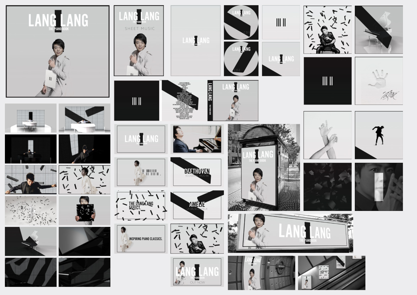
A primary concern for Piano Book was Lang Lang’s international appeal - any concept had to play for a worldwide audience, and act as a timeless statement that would cross all cultural boundaries. We put together a minimal, clean and modern aesthetic that formed the backbone of the entire album’s campaign; always allowing Lang Lang’s personality to fill the space.
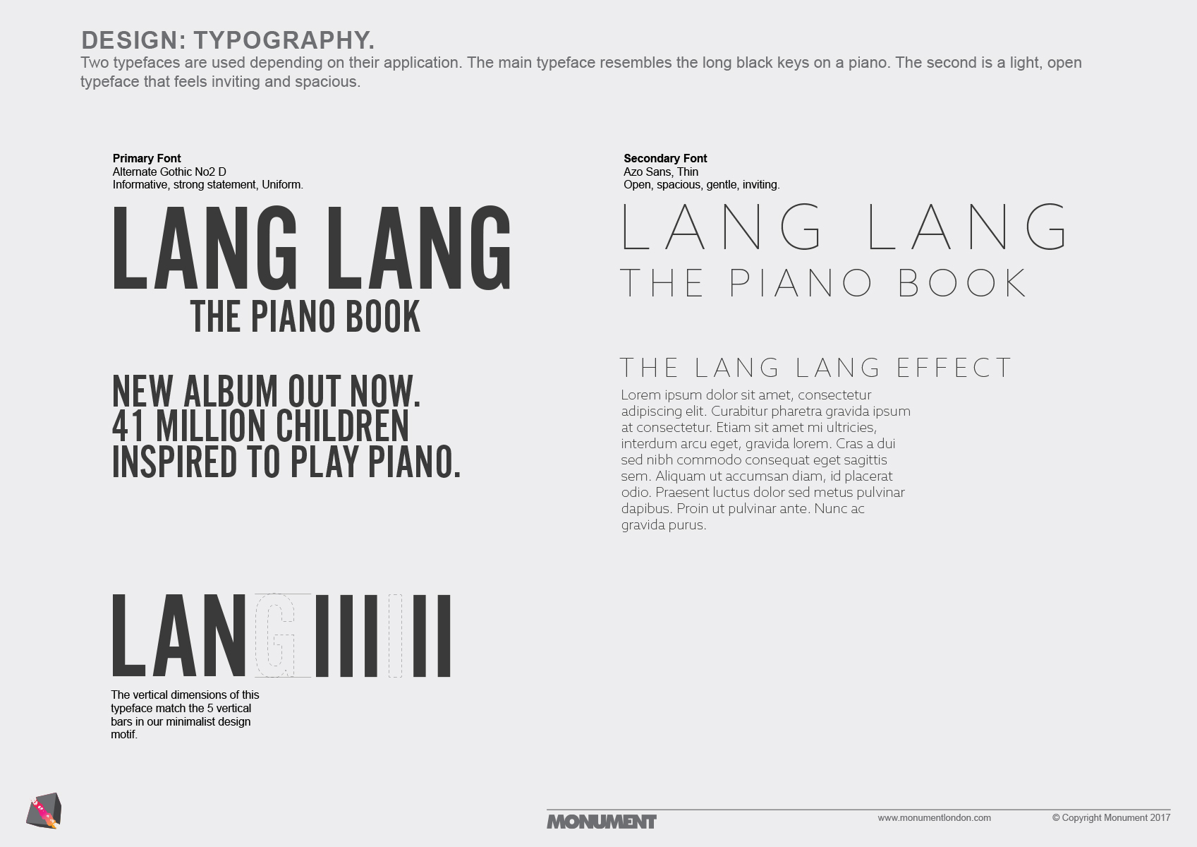
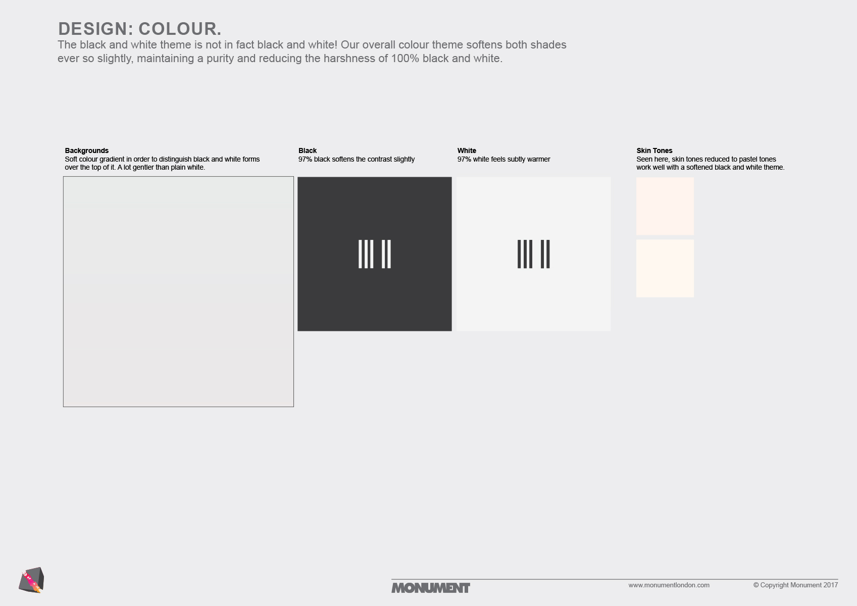
At the heart of every creative decision was a sense of tranquillity; emphasising open space, and allowing the music to breath. The typography, styling, design, colours, and framing were all chosen to emphasise these values.
As an album, Piano Book is all about learning and accessibility - even going so far as to contain several pieces that are based on simple melodies from childhood songs. We cascaded this simplicity out to all aspects of the campaign, creating a bold look that is universal in appeal - Piano Book is about the listener, in a room with just Lang Lang and a piano.
PHOTOSHOOT
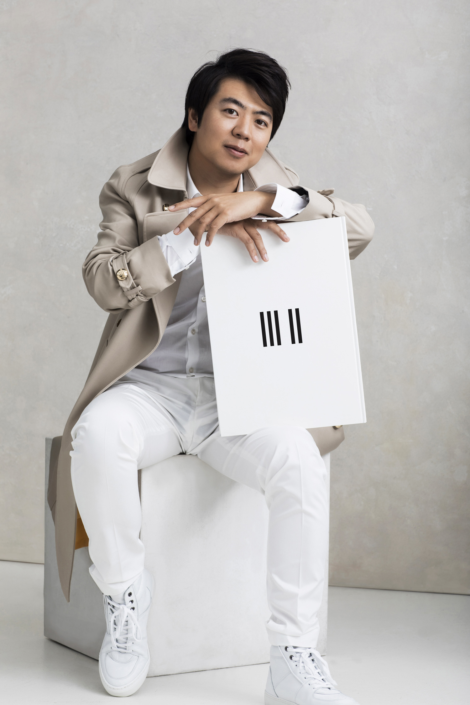
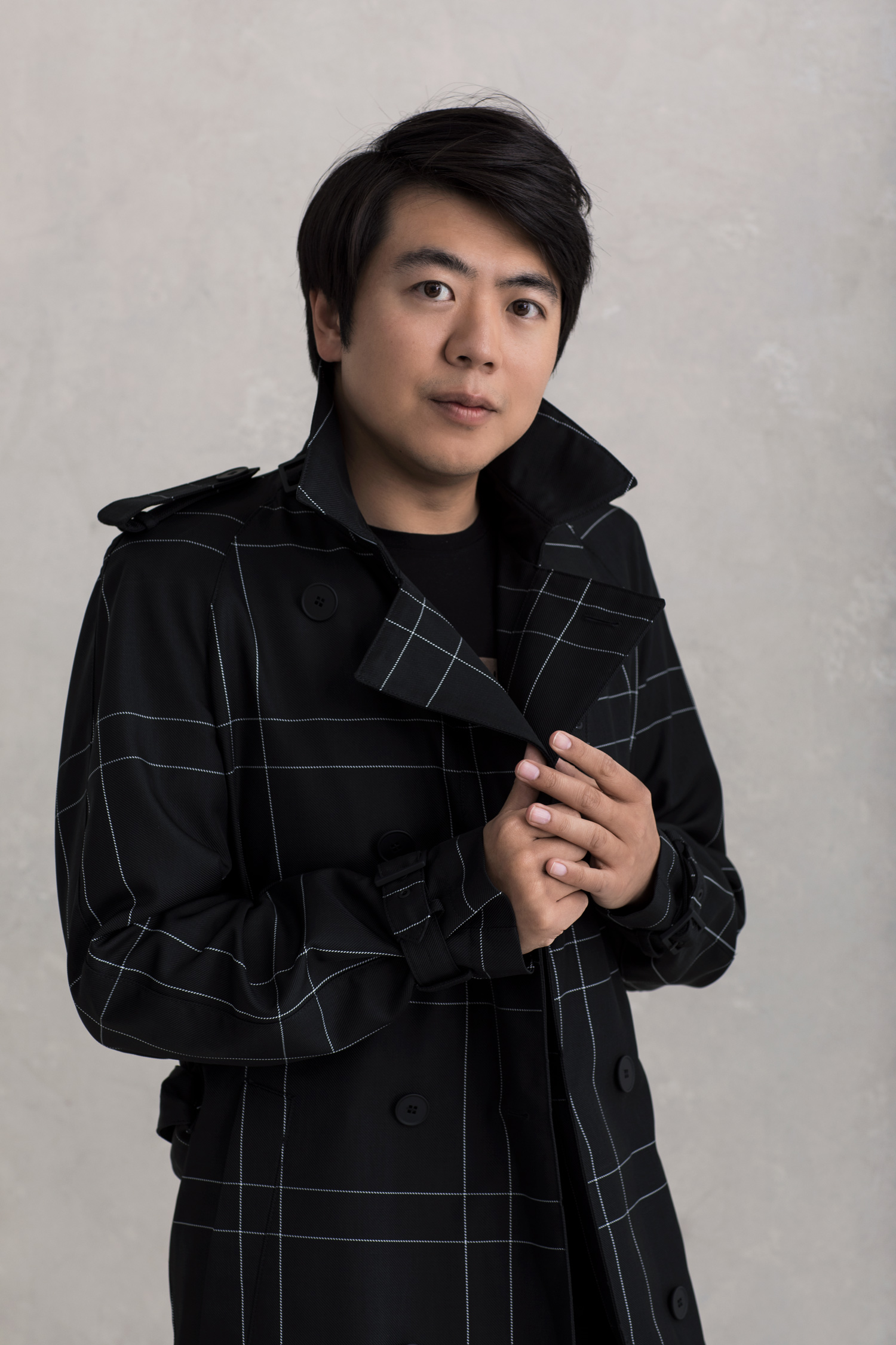
The photoshoot for the Piano Book campaign embodies the simplicity at the core of the campaign - clean, modern and open spaces that Lang Lang filled with his personality and talent.
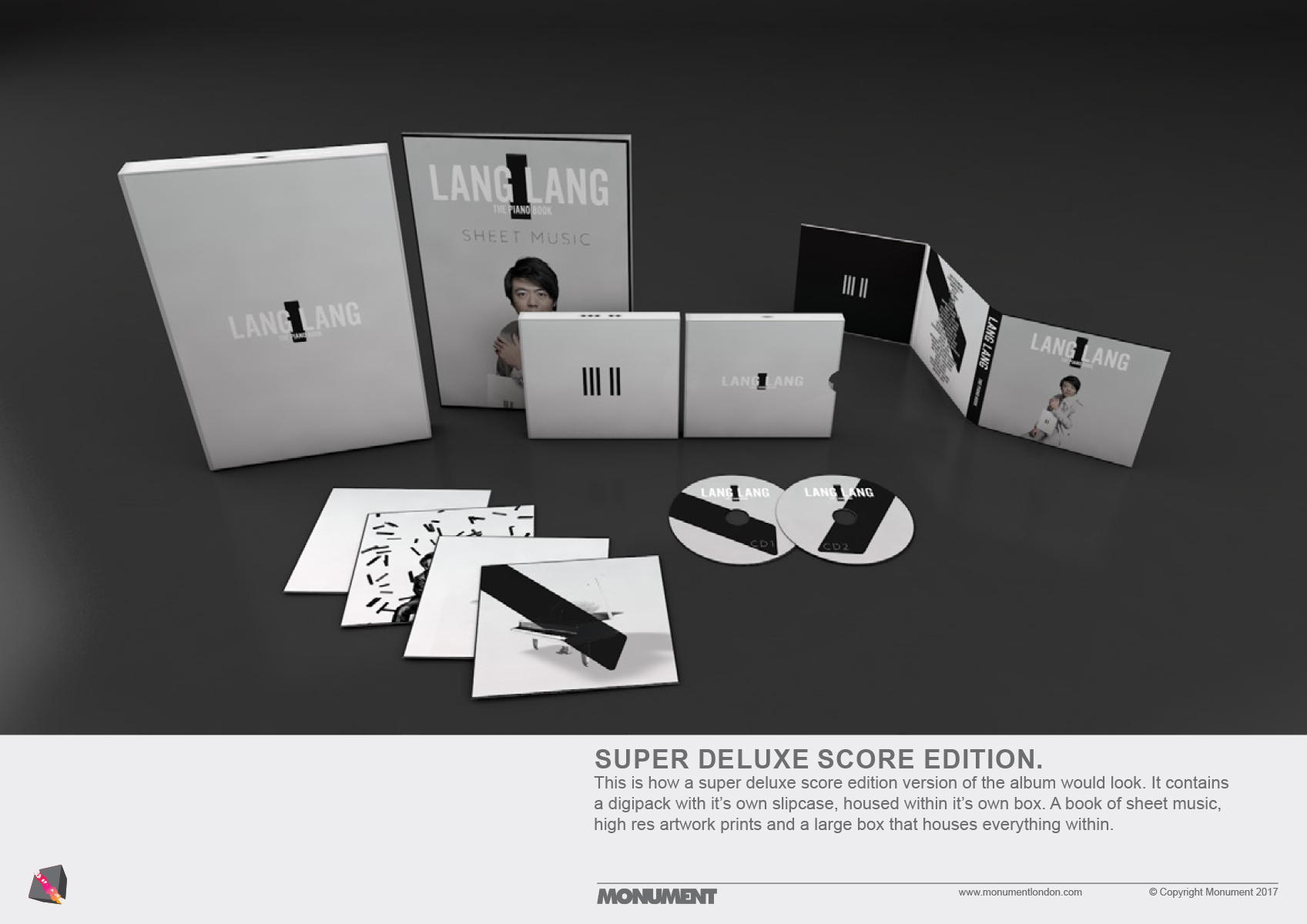
Particular attention is paid to the styling for these photos. Piano Book is not just accessible, it’s also about learning (some editions of the album even contain a score book, featuring easy to learn pieces that appear on the album.) As such, we wanted to position the audience as students of Lang Lang, with him as the master and the teacher - that’s why we dressed him in a grand coat!
© Gregor Hohenberg, 2019
Social banners
The social banners for Piano Book build on the album artwork’s concept - with a distinct visual design that effortlessly communicates the album’s title, theme and concept.
Spotify campaign materials
Lang Lang and Piano Book’s accessibility meant that bespoke Spotify assets were required to capture the attention of Lang Lang’s audience, both new and old. These banners and canvas videos are the result.
Building on the campaign’s existing aesthetic, we reduce the colour palette even further, to just monochrome and shades of red. These changes make the existing design even more graphically arresting - stopping anyone that’s scrolling past!
Spotify caNVAS
DESIGN PROCESS
A few pages from our initial design treatment


